
An exploration of COVID-19 through the numbers
I have been working with numbers and trends all my professional career. Looking at Cellular Towers Key Performance Indicators (KPI), using Statistical analysis trying to find ways to predict customer experience or make decision on expansion, capacity or prioritize problem areas, and even automation of the network through Self optimizing Networks techniques that require lots of data inputs and understanding of trends.
These experience has taught me a lot about trying to interpret the trends of data, no matter if it traffic, failures, dropcalls, etc..all data has trends some simple some very complex (ask my Dad the Mathematician)
I’m not a medical expert and I probably know as much as most of us know about Covid-19. I od read lots of news articles and try to keep open to everyones opinion. So I’m not making a political statement, medical statement or social statement. I’m just interested in showing you the facts on the charts the way I see them, as an Engineer.
Some background
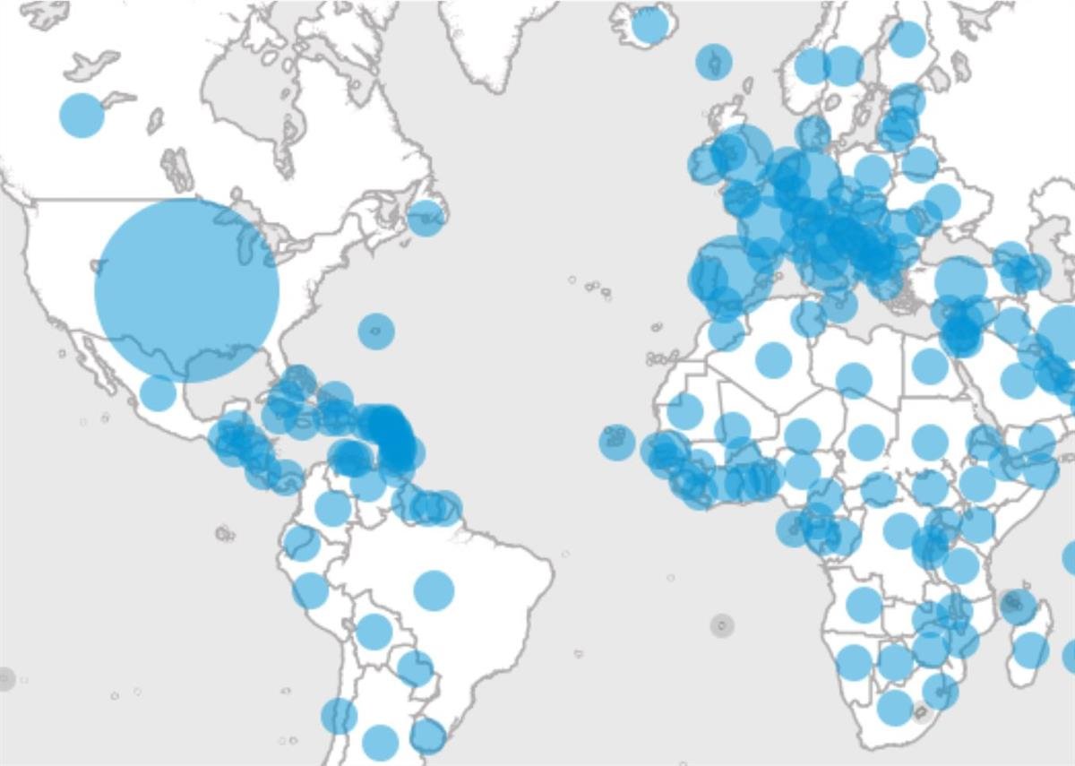
When COVID-19 hit us in March 2020, I wanted to get an understanding of how things where progressing and I looked online for a few different tools, one of the best ones was our world in data .
This website tracks data from around the world on issues that affect us world wide. The have dedicated a section to COVID-19. What I found nice about it, is that it provides several navigation tools that allow you to explore the data in details by country and by different predefined categories that through their analysis are deemed important to understand the issues at hand (COVID-19 the decease)

As we progressed through the beginning of the pandemic, I continued to use the tool, looking at trends globally on how fast the spread of the virus was in different parts of the world and the effect their different actions had in improving their statistics related to the Virus. Back then there were two main indicators that in my mind where important, Cases and death.
Why Cases and deaths?
well as a new decease we need to know how it was affecting people, death is quite a bit of an impact, and it shows the risk or danger of contracting it. Basically what are my chances of dying if I get it. Cases well tells you how fast it is spreading among the population.
These two factors at the beginning are important, we don’t know a lot about the problem, but we can determine the potential severity with these two indicators.


You can see that at the very beginning our cases counts and deaths where pretty high. This is what created an avalanche of lockdowns and restrictions world wide. The number raised the flag on the risk of the spread and death of COVID-19. Without knowing much of the virus, the right course of actions was to protect the general public.
But soon enough we started to slow it down, we managed to flatten the curve in most countries through numerous lockdowns and restrictions, and this had a huge impact on death. It also allowed the health experts to understand the Virus and look at what strategies worked
You can see that even though countries like the United States, their cases continued to go up, the number of deaths did not.
We flatten the curve of cases and our death tolls where down….
Once we hit the stage where the number of cases and death started to get under-control, things started to look a bit better. The economies of the world started to open, summer was in full swing (well, more or less)
This is when things started to look a bit better, as we gained knowledge of the virus, we started to hear about potential vaccine, and we understood the impact of social distancing and and we lowered our guard.
But why are we still in lockdowns?, why do we still have so many restrictions? I figured that data would again give me an answer. So I decided to start using more of the local tools provided by Health Canada and Ontario public health. I wanted to get a local view, what and how are we doing. Both of these tools provide quite comprehensive data on the numbers on the pandemic.
What was important now was to get all of the other factors, we had the virus under control, no more cases or a few, and deaths also down.
And all of the sudden the Second wave…..
Let’s take a look at the data now that we are in the second wave. I’ll star with a few charts that I believe are important to know. How is this virus impacting the population?
First – AGE Groups: the chart on the left if from the Government of Canada Covid 19 data set it clearly shows that by age groups the highest number of cases is happening on the ages between 0 and 59.
On the same token, the contribution to the hospitalizations of those age groups (0-59) is not that significant, maybe the group from 50-59, which could be starting to have more underlying health conditions. But if we stay consistent if we look at 0-59 years they represent more than 70% of the cases in Canada, but they only contribute to 30% of the hospitalizations


From those numbers we can observe a few things:
- First, the virus is definitely around in the general population, we can’t deny that is spreading around all age groups. We can see that the number of cases in the older groups is much lower, which means whatever measures the government is taking to protect the elderly are working (and they better work…)
- Second, even though the number of cases are high in the younger groups these people are not falling very sick and probably staying home and recovering on their own. On the contrary the age groups that seem to be getting hospitalized are the older groups, this mean the virus is probably very dangerous for those with weak immune systems or underlying conditions, like the elderly.
I think these we already knew, so COVID-19 is a bad thing is you have an underlying condition or are an elderly person with a weak immune system. But how bad it is, let’s look at ICU (Intensive Care Unit) and death numbers:


Here again you can see a trend toward the elderly, high percentage of people on the 50+ range are ending in the ICU (meaning you are really bad!). But when we look at deaths it is almost exclusive to the range of people 70+ (88% of the deaths).
Just stating the facts,
- COVID-19 is really bad if you are older 60+, and really bad if you are 80+,
- Most of the population can suffer from COVID and recover
- Even if you are in your 50s and 60s, you might end in the ICU, but still have chances to survive.
Let’s dig more into the data…
Based on these 3 observation, I one can say, it does not look that bad. Yes COVID can be deadly for a sector of the population and we have to be careful about it, but so is the FLU (Influenza virus) .
The chart below shows that 82% of all cases in canada (up to the time of this article have recovered, 15% are still active case (either in ICU, or at home), that is 97%….. with only 3% of deaths.

3% of cases since the pandemic started have died, mainly affecting elder sand people with underlying conditions. No death is good, surely 3% is not great but is not that high.
Now we know who is at risk, but also know how to treat it if you end up in the ICU.
But this is what we already know, Let’s take a look at Ontario. The next chart shows the Cases since the beginning of the pandemic in the province. you can see the second wave is hitting really bad (in number of cases), we are 3 to 4 times (400% more cases than we had in April).

But when we look the number of deaths, we are in a much better situation today. Deaths numbers are down by about 50% of what we had seen at the beginning of the pandemic. With close to 500 daily cases and 80 deaths we had a 16% mortality rate, now we have a little over 2000 cases and about 20 deaths daily, which is only 1%. The 3% we saw above comes from the initial wave which had a much higher mortality rate.
These validate our previous statements that we know much better how to treat COVID-19.

If we look in the details of the province charts split by sex and age we see the same trends, older age groups seem to be the ones ending in the ICU and ultimately death due to COVID-19, while younger age groups seem to much higher in cases, but recovering.


I wanted to go a bit more in details and figure out what each age group risk was. So I downloaded all the data

Once I calculated the percentage by age group, you can see that the death percentage on cases 90+ is the highest with close to 1%, followed by ages 80-89 with 0.28%, anything below that is less that 0.1%.
To put this in perspective, If you are in the age group of 40 to 49 probability to die from COVID is 0.001%, which means for each 1,000,000 there are 10 people that could die from COVID19 in this age group, since the percentage is quite low, one can assume that these 10 people most likely all or the majority had some sort of underlying condition.
What do I think….
I’m not going to start talking about conspiracy theories. I’m just going to state the facts that I see in the data I showed you (and believe me, I could go for hours looking at data)
I really believe that COVID-19 is a virus that could kill lots of people, but this people are those that have either an underlying condition or are have weak immune systems. For the rest of the population COVID-19 does not seem to represent a risk.
COVID-19 is spreading really fast and I do believe there is no way to stop the spread. Is on all age groups and continues to spread.
Finally, we need to continue and improve the mechanism to protect the elderly people and those vulnerable. The data shows that there is deaths on pretty much all age groups, but we can’t tell if those that died have other conditions that makes them vulnerable to the virus.
I did not cover other aspects of the pandemic, like the limited capacity in hospitals ICUs or the facts that in some parts of the world and some sectors of the populations we have multi-generations households that could be heavily impacted by the virus.
I just wanted to have an opportunity to show the data and my observations, I will leave the conclusions to you….